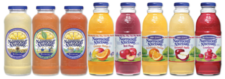
At the time the 17.5 oz base business was divided into three product lines in two basic designs, the “Squeezed” Juice line (above left) had several problems; the 48 mm lug style closure and steep shoulder of the glass package tended to spill on the consumer, the glass package had an expensive embossing and an expensive oriented pressure sensitive label set that was not communicating the right message.
The 17.5 oz “Cocktail” and 100% Juice line (above center & right) were in a different taller glass package with a 38 mm lug-style closure. The bottle was better than the Squeezed line from a cost perspective, but it was a little generic. The cut and stack labels applied to this bottle had two different die cut shapes for the two product lines.
The label graphics themselves had several challenges: There were several former Nantucket Nectars employees pictured on the labels and referenced under the cap, we had been contacted by several of them that they no longer wanted to be depicted on the package. The “All Natural” message was not consistent on the package and the illustrations were inconsistent across the platforms. There was one line that depicted a field of sunflowers, one that showed founders Tom & Tom bonding in a field of lemons and many other oddities that really communicated some kind of inside joke.
The packaging challenges were also limiting the growth of certain flavors due to manufacturing complications; two glass heights, two label platforms, three label styles, two closure sizes and add 4-packs and cases and you have a mess.
After reviewing several agencies capabilities we decided that Hughes Design Group in Norwalk, CT had the right kind of experience with national brand platforms. We had worked with them on the Stewart’s redesigns and several Mott’s Initiatives with good results.
We learned several things in the focus groups. The most important message was that the consumer did not get the message that there were three platforms. What the consumer was looking for was their favorite flavor and the flavor names were not prominent enough.
We also isolated several of the design elements and learned what Nantucket Nectars meant to the core consumer. Some of these elements were, the color purple, The Nantucket Nectar Logo, with increased “All Natural” communication, existing fruit illustrations and “Nautical” feel. Nautical like east coast, but not topical.
While Nantucket Island is very familiar to the people of Massachusetts, once you got anywhere out of the New England area, people just were not familiar with it. We decided that any illustration that needed to be done, should talk about visiting the island and be authentic, so we hired an artist that had lived on the island who could mimic the look of the old labels. We did not want to illustrate actual locations on the island, but have elements such as one of the actual ferries, the Allserve store, a lighthouse and some of the dunes.
We also took the opportunity and had the artist illustrate four different scenes to add to the billboard look when on-shelf. The label template was enhanced further with a die cut shape for the flavor badges at the top. If you have read this far I will let you in on a little beverage secret, it is a really good idea to put your flavor names on the top of the labels near the shoulder of the package. If they are too low they will be cut-off by the glide rack and really hurt you where it counts the most: in the cooler!
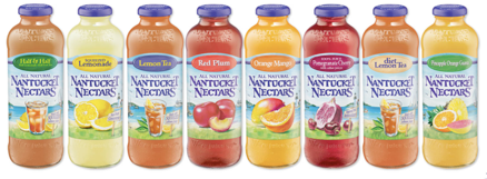
The glass bottle design was changed to incorporate some elements of the squeezed bottle as it was determined that this design had a more distinctive shape. We made it taller and placed the tag line “We’re Juice Guys” along with the Nantucket Nectars logo and incorporated an easier to drink from 38 mm lug style closure. The “under the cap” sayings were also reviewed and we got rid of the obscure employee references and added facts from Nantucket Island. We felt that each cap should teach the consumer something about the drink or the island to be true to the brand. The now taller and more narrow glass bottle also had a larger labeling area which is a big win. . .
I did a flavor study by lining up all the filled bottles without labels. This allowed me to see that there were several red and orange beverages. The challenge was to badge the flavor name at the top of the bottle so the consumer could reach for their favorite flavor without being confused. I used a combination of unique pantone colors and reversed the type when I ran out of options. The second challenge was getting the chosen badge colors to reproduce in six color process. Six color process (sometimes called Hexachrome) allows the litho printer to print less forms matching the production run more closely and saving cost.
Some other things that were done to further save the brand cost was to take the peach off the closure, it was absolutely the most complicated cap (and expensive) on the market. Five colors to two = big savings. The corrugate was changed to kraft stock from bleached white material which is more sustainable and less expensive.
The brand now sports one bottle, one cap, one label template, one 4-pack and one case template and a consistent, easy to get brand message. There were huge savings both at the factory and in-market on the shelf. Without any other marketing support other than SKU rationalization, the brand was up 25% in 2007. Hughes Design Group also won the 2007 American Graphic Design Award from Graphic Design USA.